Glossier CRO Audit - Optimizing Conversion with Aesthetic Clarity and Trust Signals
Analyzing Glossier’s website using CRO best practices to improve conversion, user experience, and design clarity.
🧩 1. Overview
- Brand: Glossier
- Product: Skincare + beauty for Gen Z and Millennial women
- Target Audience: Aesthetic-conscious, values authenticity, social-native buyers
- Main CTA: “Shop Now” button linking to the new Lip Glaze release
- Your Take: Glossier converts by not over-selling — leaning into aesthetic clarity, identity-based messaging, and high trust signals
👀 2. First Impressions & Clarity
-
Above the Fold:
The hero section features a creative, youthful video that reflects the brand’s target market. This video immediately engages users and aligns with the aesthetic preferences of Gen Z and Millennial women. -
Navigation:
Clean with a clear "Shop Now" button, but the white background blends with the video’s color palette, making the CTA button somewhat invisible. There are 7 navigation items in addition to account buttons, but the small font size (0.75rem) and thin text weight (400) make it hard to read. -
F-Pattern Layout:
The site’s F-pattern layout places the main CTA above the fold, aligning with the common best practice for conversion. However, the navigation is cluttered, and the small text detracts from the page's effectiveness.
🧠 3. Psychological Triggers in Play
Glossier effectively utilizes various psychological triggers throughout the PDP and landing pages:
-
Visual Salience paired with the Halo Effect:
Products are shown with high-contrast colors that appeal to the youthful audience, leveraging the Halo Effect to make products appear more desirable. -
Social Proof:
Testimonials, customer reviews, and social media posts are featured prominently, reinforcing trust and encouraging new customers. -
Scarcity:
The "Limited Edition" label creates urgency, prompting customers to act before the product sells out. -
Surprise Effect:
On hover, the logo changes to “You look good,” creating a playful and unexpected interaction. -
Von Restorff Effect:
"NEW" product tags are visually distinct, drawing attention to new arrivals and generating curiosity. -
Illusion of Truth Effect:
Repeated phrases like “Cooling, creamy lip oils” reinforce product benefits, making them seem more credible.
- Behavioral Model:
Using Foggs Behavior Model (B = MAT), Glossier motivates users by making the product feel fun and appealing, while ensuring frictionless access to the CTA. Frequent bold CTAs, banners, and a floating cart enhance the purchase journey.
🎯 4. Conversion Flow & Layout
Glossier uses an F-pattern layout with key information above the fold (CTA, free shipping banner, navigation items). However, there are some issues:
-
Navigation:
Clear and distinct links, but the small font size (less than 0.75rem) makes reading difficult. -
PDP Layout:
The layout remains consistent with the F-pattern. Social proof, Von Restorff Effect, and Illusion of Truth are applied. The customer can modify product options and combine it with sets (upselling). Smooth animations and FAQ pop-ups reduce friction. -
Cart Experience:
When an item is added to the cart, the cart slider appears but lacks clarity. Customers are unsure of how to proceed with their purchase, as the checkout button is hard to find due to small text. The cart slider is cluttered with information like bundling, shipping info, and sales tax, adding friction. -
Endowed Progress Effect:
A progress bar that shows how much more to spend for free shipping motivates additional purchases.
✍️ 5. Copy & Messaging
- Tone: Friendly, informal, and creative, appealing to the target audience.
- Focus: Benefits, identity, and experience. The copy avoids hard-selling or technical specs.
- Microcopy: Product use instructions are written in a casual, conversational tone, like a friend texting.
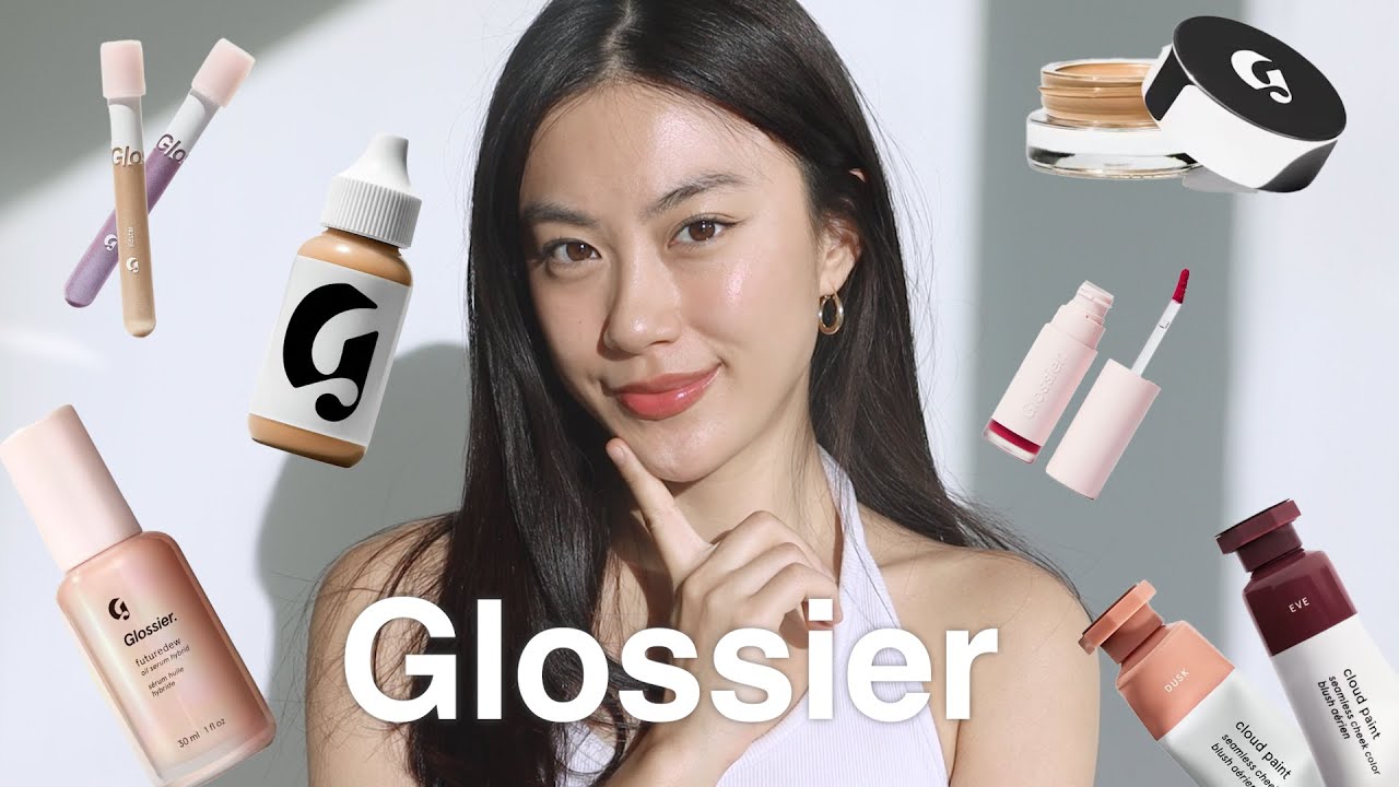
🎥 6. Media & Visual Communication
- Video: High-quality, engaging, and reflective of the youthful target market. It’s one of the most converting pieces of media on the website.
- Images: HD, with a clean pastel palette and minimalist background, aligning with the brand’s aesthetic.
- UGC: User-generated content is integrated throughout the site, with well-curated posts and strong copy.
🔧 7. Design Best Practices
✅ High contrast
✅ Mobile-first design
✅ Font family used is Apercu, a sans-serif that matches the brand’s identity.
❌ Font too small and unreadable in many parts (especially navigation links).
✅ 1-2 CTAs per section
✅ Website PDP and landing page layout have zero clutter
❌ Checkout layout is cluttered, adding friction
✅ Visual hierarchy supports scanning
📉 Conclusion
Glossier effectively uses psychological triggers like social proof, scarcity, and surprise effects to motivate purchases. These are well-executed and visually appealing, contributing to a strong brand presence. However, there are significant performance issues—notably the small navigation font and a checkout process that lacks clarity, both of which introduce unnecessary friction.
The web performance—especially the cart experience—could benefit from simplification. The checkout CTA is hard to locate, and the slider includes too much secondary information (e.g., bundling, tax, shipping details). Streamlining this step with better visual hierarchy and CTA clarity would likely improve conversion.
Advanced CRO Note:
While Glossier leverages broad psychological triggers well, they appear to be applied in a blanket manner rather than aligned with a user’s stage in the conversion funnel. For example:
- Early-stage users (awareness/interest) might respond better to novelty, surprise, and aesthetic clarity
- Mid-funnel users may need authority cues, value framing, and comparisons
- Bottom-of-funnel users typically convert more with scarcity, urgency, and risk reduction (e.g., free returns, satisfaction guarantees)
To go beyond surface-level optimization, Glossier could test funnel-aware bias deployment, ensuring that the right psychological effect is applied to the right customer context. Currently, the site uses a set of umbrella cognitive techniques, but doesn’t adapt dynamically based on user behavior or intent—leaving untapped potential for deeper conversion gains.
Check out Glossier's website here.
CRO That Drives Revenue, Not Just Clicks
I help DTC brands turn browsers into buyers. If you're scaling an online store and care about performance, UX, and data-backed growth—this is where real conversion strategies live.